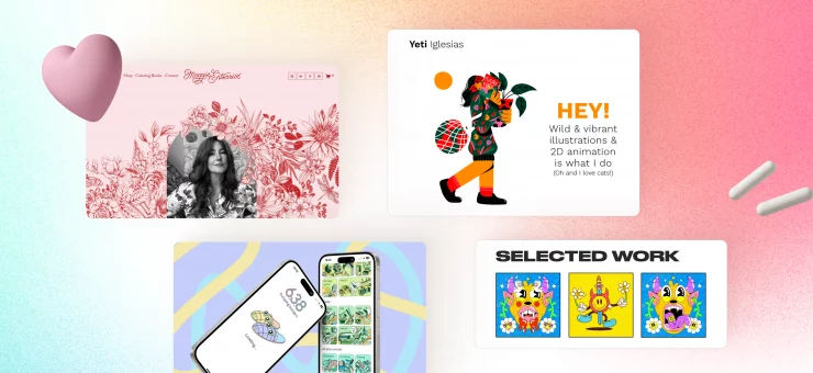
Learn how to create better Pinterest graphics that will drive traffic to your site and pique people’s interest in your products and services.
Designing Pinterest graphics for your well-thought-out blog is crucial. Consider them as a window to the blog you worked hard to create and wish to share with the world.
Pinterest is more of a search engine than a social media platform, primarily dominated by images. People visit the site to get answers, ideas, and inspiration. The site has been well-known for sparking the imagination and curiosity of viewers with bright visuals and aesthetics.
With this in mind, your Pinterest graphic should not just be pretty. It should also spark enough motivation to attract clicks to drive traffic towards your site. All that Pinterest traffic can then be converted into customers of your physical products, online courses, or consulting services. Whether it was built using website builders or custom-made from scratch, it needs the attention that could come from Pinterest.
Practices on Designing Effective Pinterest Graphics
Designing Pinterest graphics that can generate more clicks back to your site takes more than just simple photo editing. Here are effective ways to create Pinterest graphics that attract and engage.
Use high-quality images that speak your brand
With a lot of Pinterest graphics presented to users, you only have a few seconds to stand out and grab their attention.
Make sure that the images that you use are not blurry or pixelated. Take note that Pinterest recommends a 2:3 image aspect ratio for graphics, so it is essential that you use high-resolution images to upload cropping, or resizing will not affect the image quality.
If you do not have a high-quality picture database, there are many alternatives to acquire the perfect image for your Pinterest graphic. One way is to find readily available images from reliable stock photo sites. Choose from an array of professionally taken photos but take note of licenses to avoid accidental copyright infringement.
It is also important to choose images that are relevant to your brand. Failure to do so is one of the most common mistakes committed when using stock images.
A tropical brand will not use an image of a snowy landscape for its holiday-related Pinterest graphic, no matter how high quality it is. It leaves confusion to the viewer. It also gives the impression that you are inauthentic and unworthy of their trust.
Pair images with relevant text
Good-looking text overlays are just as important as the image when deciding on how to design Pinterest graphics. It’s like fishing. The image is the hook that will catch the attention of the viewer. The text that comes with it reels the viewer into clicking that visual. Both are equally significant to drive clicks to your site.
Almost all Pinterest users visit the site from their mobile devices. With that, you have to make sure that the texts are large and readable for any type or size of the screen.
At the same time, consider the text style that you are going to use. Calligraphy-type fonts may be pretty, but the design or thin strokes might make them unreadable on small screens. It is also advisable to use contrasting colors for texts. Text with a black outline is readable against almost any kind of background image compared to something like a blue text with a violet outline.
Make the most of the limited space in creating text overlays. Be direct to the point and use your primary keywords. The Pinterest algorithm considers the text on the graphics when providing search results.
Add a post title and description
You may have the most aesthetically pleasing Pinterest graphics but, without the proper post title and description, you may not appear as high as you would expect in Pinterest relevant searches.
A good post description is just like a blog post description. It should be relevant and concise yet intriguing enough for the viewer to want to know more. It is a summary or a teaser of what the site offers when you click on an image.
For the title, it is advisable to state the actual title of the post that the graphic design is linked to. Good practice in creating post titles is to reiterate the primary keywords.
Make sure it speaks to your brand’s niche
Defining your brand’s niche market is an essential factor in the success of any marketing strategy. Great marketing capitalizes on the demographic profile, personality, and interests of your online niche market. Learning how to design Pinterest graphics is not an exception.
Everything from the color palette to the type of fonts of the overlay should be relevant to your niche or brand. Doing so is one way to build a brand that attracts a loyal following. A well-designed Pinterest graphics is like an arrow. It is easier to use one arrow to hit a specific target than just to shoot in the air in hopes to hit any of the targets around.
People will most likely click on Pinterest graphics because 60% of users use the platform to view photos primarily. So make sure that the design reflects the message people are looking for when they run a search.
Design multiple Pinterest graphics for one site post or blog
This will help you make the most of the Pinterest algorithm. Creating graphics of various designs for one post or blog will help you spread your presence further in relevant searches. Imagine someone searching for a specific topic on Pinterest, and the top five graphics that pop up all lead to your site.
It also gives you more opportunities to share your site multiple times on Pinterest. This is because sharing the same Pinterest graphic arts repeatedly might be counted as spam. This may result in your site actions being restricted. Ultimately, your account might be deactivated.
So vary the images and graphic designs that you use. The most crucial factor is that every image upholds the same quality and attractiveness to maximize your reach and boost your customer acquisition efforts.
Add a call to action (CTA)
Pinterest users go to the site for various reasons. Some look for ideas and inspiration. Others look for things to shop for. There are users who go to the site looking for pins to add to their profile. There are also users who are looking for answers to their specific queries.
Creating a well-designed Pinterest graphic design may be beneficial to any type of Pinterest user at any given time. The reach and exposure may increase, but, in the end, the varied activities do not automatically result in an increase in traffic to your site.
A call to action in the post description or in a banner in the graphic art itself reminds the viewer that the specific image comes with an action they must do.
CTAs should be direct to the point. Keep it short and straightforward. A simple “Click to know more” will work. This creates a sense of urgency for the viewer to engage with the Pinterest graphics and not just save them for later.
Keep all your graphics consistent
Consistent design across all your Pinterest board provides brand association and familiarity. Being consistent in designing Pinterest graphics builds trust for your brand. Use similar color schemes or font faces. Creating recognizable graphics helps your brand stand out as well.
At the same time, your Pinterest profile defines your brand. Consistency helps in delivering your brand across, sending a clear message to viewers.
It is easier to use a template, ensuring a more comfortable and quicker design process. It also maintains consistency across all designs. You may choose to create the template on your own using different photo-editing applications or edit and customize readily available design templates.
Conclusion
Learning how to design better Pinterest graphics that will attract clicks is like learning how to dress to impress. The right design will catch the viewer’s eye and spark their interest, so they’ll want to know more. At the same time, it gives an impression of what the site has to offer once the viewer clicks on them. More important than the aesthetic, Pinterest graphics that stand out and drive more clicks are the kind that provides value upfront.
So take your time and have fun experimenting with the designs and layouts. Find out which of your masterpieces attract the most number of customers and leverage them to your advantage.
About the Author: Hanson Cheng is the founder of Freedom to Ascend. He empowers online entrepreneurs and business owners to 10x their businesses and become financially independent. You can connect with him here.
Title image from Flame pack in Ouch illustration library
Learn how to apply UX design to multilingual websites, check the fundamentals of visual branding online, read how to find fonts that suit your brand image, and how to build a social media conversion funnel.


