Coming up with a small business website design that is fully functional is easier said than done. If you have a website that crashes, lags isn’t visually appealing, or is hard to get around – you can kiss those conversions goodbye.
If visitors aren’t impressed within the first few seconds, you will lose them to a better website. That leads many small business owners to ask themselves: how do I improve my website’s design? Below are some easy website design tips for small business owners.
- Pick a simple and elegant design
- Responsiveness is key
- Learn how to use color
- Incorporate social media into your design
- Use images in a smart way
- Use appropriate typography
Pick a simple and elegant design
One of the biggest mistakes that website owners make is having a website with all the bells and whistles. That includes high-resolution images, complicated JavaScript, and animations everywhere. While this is nice, it can easily overwhelm visitors, which is a huge turn-off.
Also, a complicated design can slow your website — conversion rates drop by 7% with each second delay. So, on top of picking a trustworthy provider with faster servers, a simple and elegant design can do wonders for your load speeds.
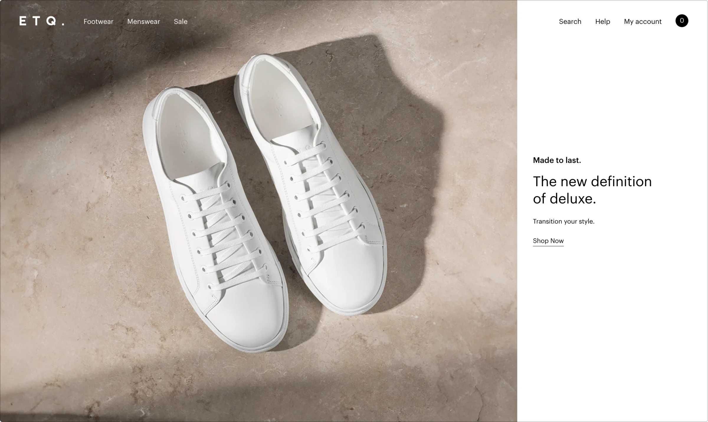
We’re seeing user-friendly minimalistic designs popping up everywhere. To illustrate how this design functions, let’s take a look at ETQ. The company has gone for a minimalistic approach that uses engaging product images and soothing background colors without overloading the visitor’s senses. The website also loads quickly, allowing anyone to get into the business of buying shoes immediately.
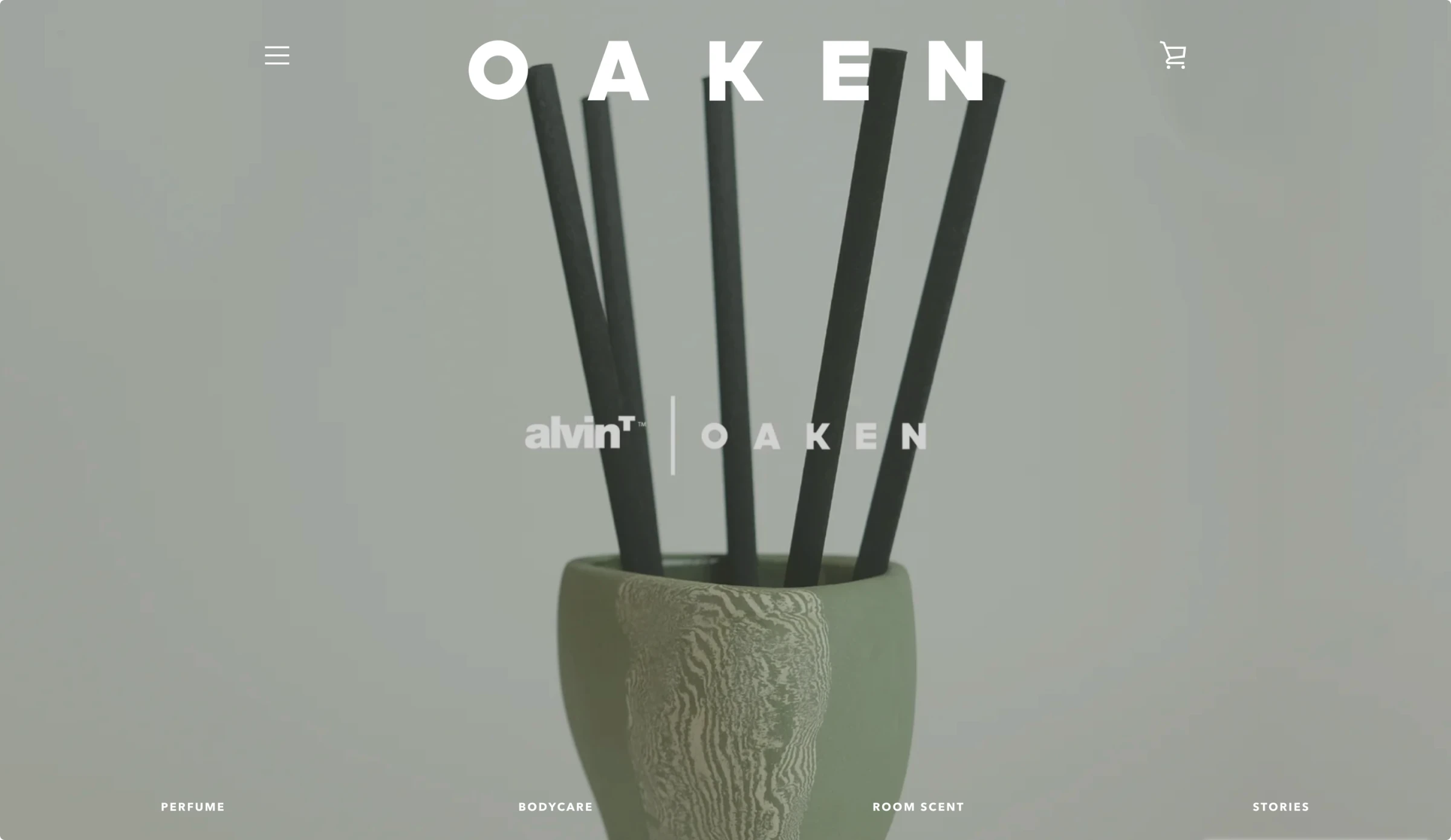
Additionally, OAKEN, an Indonesian brand that is known for its unique fragrances, takes the clean, minimalistic design one step further. Their homepage doesn’t include any bold visual graphics or chunks of text. Instead, the users are presented with a sleek photo of their product and minimalistic navigation on the sides, providing the brand’s aesthetic of simple luxury.
All in all, a simple design doesn’t overwhelm the user and helps the website load much quicker.
Responsiveness is key
People don’t browse using computers as much as they used to decades ago. These days, mobile devices have taken over, meaning you have to make sure that your small business website is mobile-friendly. Responsiveness is the key to mobile-friendliness.
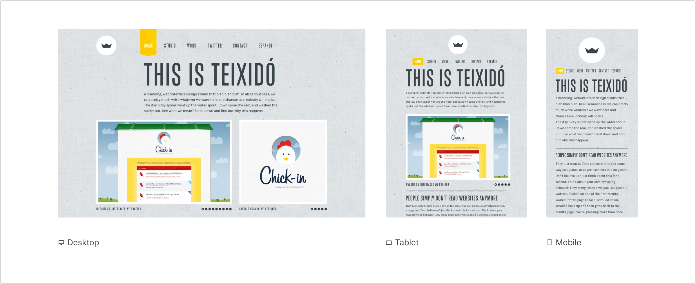
Take Teixidó (branding and web design agency), for example. It was built with responsiveness in mind, allowing for seamless user experience across all devices.
Learn how to use color
Color is a significant component of great design, and you need to experiment with it to create something great. Don’t just randomly pick colors and hope for the best. Make sure that you choose a color scheme that is in line with your brand or product.
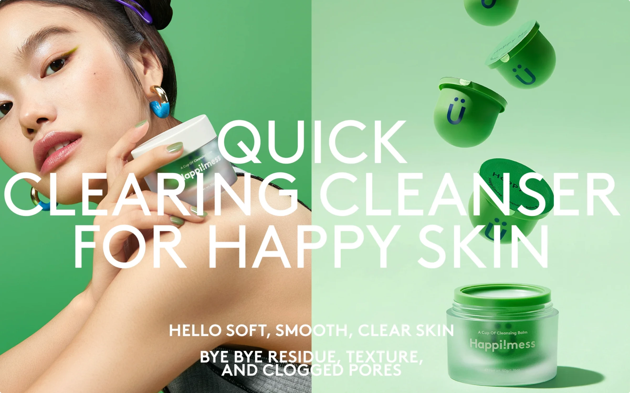
If you look at Happi!mess’s website, they used a dou-tone background to communicate their message — buy their bright and modern cosmetics. The left side is a darker green color that reflects in the contrast of the bright model skin, while the right side is filled in slightly lighter green, contasting with the quircky product packaging.
This vusial language delivers refreshing feeling.
However, you don’t have to be conservative with color. While picking one shade and basing the whole color palette around it is a safe choice, you can take some calculated risks. Try going for more than one color if they match your brand identity.
For example, Anton & Irene design studio website uses color in an eye-catching and interesting way. They create a visually stunning contrast by mixing different bright colors on scroll. The result? A visually attractive homepage.
Overall, you could choose a monochromatic color scheme or a more daring palette. However, the most important thing is to be consistent in using color.
All of your small business communication should include the same coloring for a coherent brand image.
Incorporate social media into your design
Social media has bridged the communication gap, allowing people to communicate with their loved ones easily. That is especially true if people are in different geographical locations from each other. It creates an opportunity for small businesses to get in on the action as well.
Platforms like Instagram, Facebook, and Twitter have millions of active users each day. By adding share buttons to your website, you can direct visitors to your social media pages for more content.
Social media icons can also be used to share content across social media, allowing a broader audience to get acquainted with your work.
Besides that, social media integration could enhance your website design.
NOWNESS is a perfect example of how to connect social media to your website. They have placed social media icons in strategic places.
The one on the header and right pane take you to their respective social media pages, while the ones on the bottom allow you to like those pages.
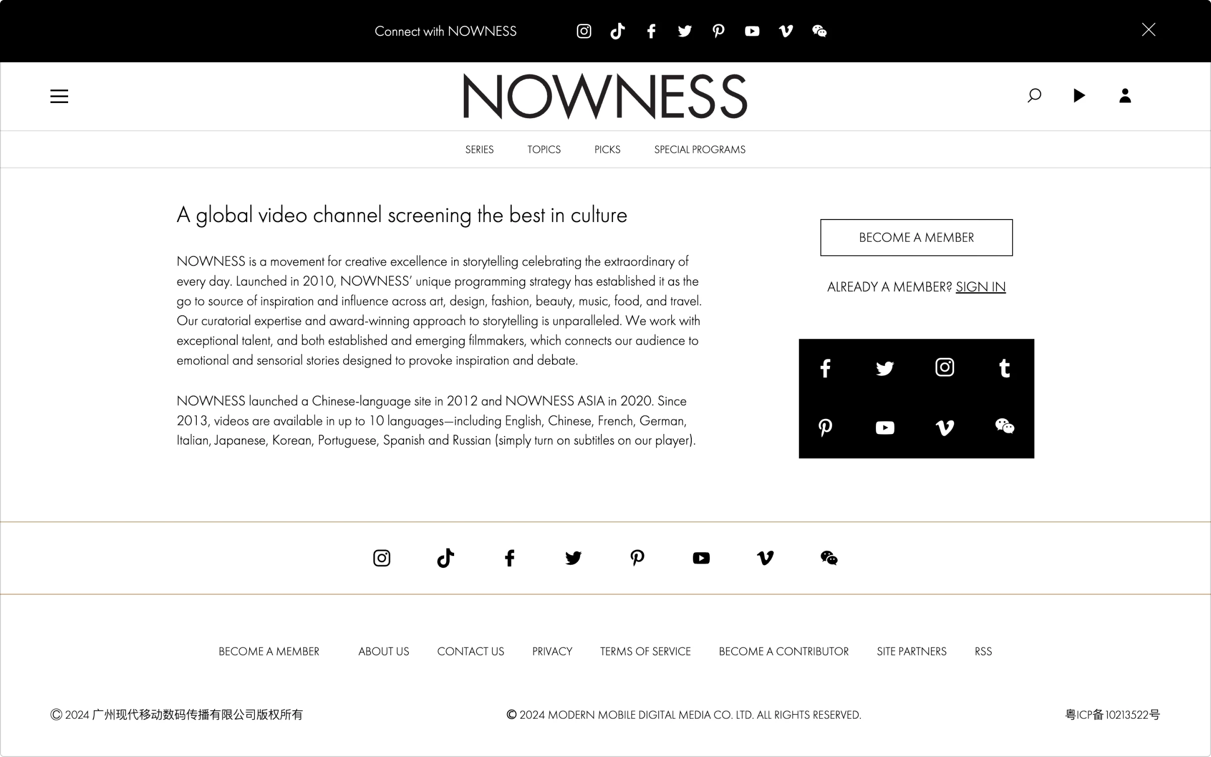
Note how seamlessly the social media icons blend into the design. They add both functionality and design.
You can see more examples of this topic by seeing the portfolios of the agencies that make website design in Malaysia.
Use images in a smart way
Adding images is a great way to make your website more appealing and deliver your message with high-quality visual design. And there are so many websites out there you can use to get high-quality, copyright-free pictures, like Icons8 Photos, Pixabay, Unsplash, and Stocksnap. However, you have to be smart when it comes to using images.
Here are a few tips to keep in mind:
- Avoid low-quality images: Low-quality images leave a bad impression, so make sure each image you pick is high-quality. If it is too large, you can always compress it.
- Make sure images are relevant: Make sure the images are relevant to your brand and marketing objectives. You don’t want them to contradict those two things.
- Make sure the images are informative. Just because images make your website look nice does not mean they should be purely decorative.
A good example of a website that uses images in a clever way is Studio Rotate°, an online branding and design agency. They have used a cards-based design, mixing together photos, illustrations and animation.
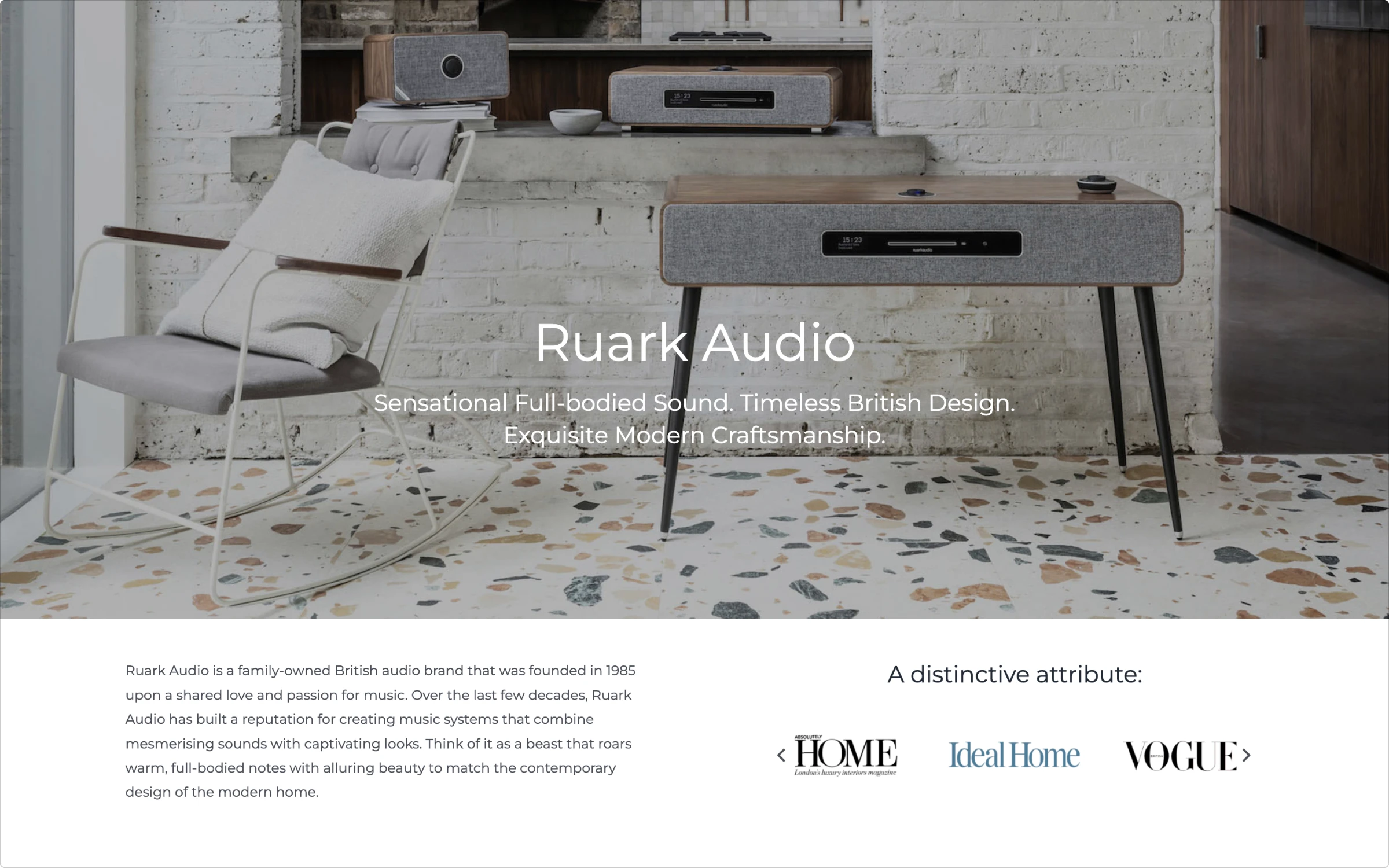
However, you don’t have to overburden your homepage (or any other page of your website) with images. Ruark Audio, for example, chose to include a large-scale, high-quality picture of their products on the homepage.
Whether you’re filling your pages with a lot of imagery or using it minimally — make sure the pictures are high quality and relevant to your brand.
Use appropriate typography
While the meaning of the text is essential, so is the visual appearance of it. Your choice of fonts, font sizes, text color, and other text attributes significantly affect how others see your brand. In short, typography is one of the critical elements of your brand image.
Here are several things you should keep in mind when formatting text on your small business website:
- Don’t overuse complicated and intricate fonts. While they might look visually appealing, overusing them will create a chaotic look. Instead, opt for simple and minimalistic fonts.
- Use web-safe fonts. These fonts (such as Helvetica or Ariel) can be viewed on the majority of devices. In contrast, if you go with the custom and intricate font, some users might not be able even to see the font. It doesn’t matter how good your copywriting is if no one can read it.
- Don’t use the same typography for everything. Text size, color, bolding, and italics add a lot of character to the text. Don’t skip them. Not everything has to be the same size or even the same font.
Let’s take a look at the House Creative website. They opted for two different fonts to describe their services.
The brand message is written in a bolded and bigger font than the menu at the very top. That’s because bigger and bolder font grabs the reader’s attention. The menu at the top utilizes a smaller yet very clear font. It’s visible even on the video background.
All in all, don’t only pay attention to what you write — make sure what you write looks good as well.
Great website design is a must
Your small business website design must make an unforgettable first impression. In fact, 75% of visitors create an image of a company based on how the website looks. And if visitors like what they see in terms of the design, your business instantly has more chances of being attractive.
So, make sure you don’t overdo the design. To take your website’s design to the next level, get inspired with web design examples, choose simple, user-friendly, and minimalistic layouts, optimize the images, and use the color scheme thoughtfully.
About the Author
This is a guest post by Paul Mahony, Senior Content Creator at Hosting.Review, who is always on top of new trends in website creation, hosting, and UX niches.
Read how UX design increases trust and loyalty, learn how travel brands use conversational UI, and check how to apply localization of your website effectively