Learn how mobile apps are created: go through all the stages of application design and development, from the idea to release and testing.
Most modern people would find it difficult to imagine their day using the smartphone «just for calls». Most mobile devices jumped far beyond the primary goal behind them — making phone calls and sending simple instant messages. Today even quite a simple mobile presents a platform to house various applications for everyday use that turns thousands of people into grateful users of more and more apps. Simple or complex, informative or entertaining, minimalist or packed with bright and catchy details, practical or joyful, meeting the user needing them, they make life better. The variety of apps available today enables users to do a great variety of things using their mobile phones only. Setting an alarm for tomorrow, calculating expenses for the next week, or sending mum a selfie via the messenger app, the vast majority of users don’t even imagine how many people stand behind these simple everyday operations.
Earlier in our articles, we have already unveiled the typical steps of creating interface design for mobile applications. Today let’s go further and set the full path of creation for a mobile app, from setting the idea to its release in the App Store.
As well as in any creative process, making a mobile application out of the thin air is a sophisticated process that has its individual peculiarities and features in every particular case. Still, on the basis of Tubik Studio extensive experience in creating diverse applications, it is possible to define several typical creative stages for this process, such as the following:
- setting the task and initial scope of works
- estimation
- user/market research
- UX wireframing
- prototyping
- UI design
- animation
- software architecture planning
- iOS development
- testing
- release
- updates.
Although you see the sequence of stages, it doesn’t mean that every further phase starts only when the previous one is completed. It’s impossible to imagine this kind of linear dependence as many processes and stages are interconnected even not being consequent in the presented list. Moreover, some of them like testing or estimation come up here and there being spread for all the process of app creation. Now let’s go along this way step by step to see how a subtle idea becomes a real mobile app.
Setting the task and initial scope of works
As we have already mentioned in the article considering logo design stages, the point of setting the task is the foundation of all the design, and then the development process. At this point, the team of designers and developers should obtain maximum information from the client to mark the right way to the goal. The one who walks without a destination in mind will possibly come nowhere. In product design it works the same way: to get the result, you should clearly set the goals from the very start of the path. It doesn’t mean that the goals should stay totally the same at the end of the journey: the proper level of flexibility has to be set as the objectives can modify more or less in the creative process, research and testing. Still, if the general goals are not set at the start, the creative process can get easily transformed into a mess.
Another vital tip, which we have seen through long practice, is that communicating with clients you should get not only their wishes but also try to get the ideas and reasons behind these wishes. If you understand why your customer wants to see particular colors, shapes, or transitions, it will be easier for you (if necessary) to justify other methods of realization for these ideas which would give the result desired by the customer and at the same time user-friendly and thoughtfully consuming resources or enabling interactions.
The more information you get from the client, the better it is for setting the right direction. Design briefs, calls and Skype-conferences, chat in Slack, brainstorming sessions, mood boards can all form a good starting line for productive work. In our case, this point of the journey is started by sales managers and business analysts who take over the first line of communication with clients and are experienced in setting the bridge between the customer and the creative team.

Tubik Studio Head of Operations Kate uses all the means to communicate with clients and get into projects
At this stage, it is highly advisable to get the data about:
- the nature of the product and its USP
- the target audience
- geographical targeting (if available)
- the keywords with which the company represents its identity
- preferred structure and functions clients see as vital in the app
- preferred visual features (color palette, general style, special features, connection with other already
- existing digital products or brand strategy, etc.
- potential technologies, devices, and surfaces at which the app will be used
- the need for consistency with existing corporate identity (if available)
- nature of data processing need of server-side and additional technologies
- specific preferences
Obviously, the list is not completely full, still, it contains the most important positions needed for setting a general design and development flow. The outcome of this stage is the diverse set of information blocks establishing the basis for further estimation of the project, planning logical milestones and sprints as well as working our efficient design and development solutions.
Estimation
The data collected at the previous stage enables business analysts and sales managers to provide the client with the first-level estimation of the time needed for the project and therefore the planned costs. As in any creative process, it is practically impossible to make one totally exact estimation which will stay the same during the whole project: this is the data that should be got back to and reviewed after every stage of the design process. Certainly, there can be some cases of products that are quite simple, have a clear structure, and do not include many screens or elements, so estimation will be quite exact from the very first stages of processing the client’s data and wishes. However, the more complex is the project, the higher are the chances of estimation reviews and adjustments. One more vital thing to mention: these reviews do not necessarily mean growing pricing or timing, as in the creative process designers and developers can find ways of optimization for design and technology solutions which can even shorten the initial estimation.
This flow is close to perfect in cases of full-stack teams: it means that business analysts can involve designers and developers in the assessment process from the earliest steps of analysis and estimation which are able to provide more real and exact planning of time and costs. Furthermore, specialists participating in the discussion are able to contribute a lot of knowledge and experience on technical details and factors influencing the time and resources needed for the app design and development.

User/market research
This is the stage when being based on the established task and aims, the UI/UX designer starts the path by getting deeper into the environment in which the future application will function. The research stage usually moves on in two directions simultaneously: user research and market research.
User research means getting deeper into details of the core target audience to understand their preferences and psychological peculiarities, the influence of different factors like colors, stylistic decisions, and logic of interaction on emotions and experience of the defined group, the sources of information and creative performance ways which could engage users and make them active. Marketing research means exploring the market segment, primarily from the perspective of creative solutions used by competitors. Visual design presumes to create an original and recognizable style that will make the product stand out of the crowd and draw potential customer’s attention.
Famous guru of advertising David Ogilvy emphasized the great importance of research for creating effective results: «Advertising people who ignore research are as dangerous as generals who ignore decodes of enemy signals.» Time has changed the means, goals, and technologies, still, the vital role of research established even stronger. Neglecting the research stage and relying only on their creative intuition, experience, and talent, designers risk failing this task as they will not know the conditions of the app functioning and will not be able to make it efficient, user-friendly, and original.

UX Wireframing
It is the process of creating the general structure of the designed application or website. It’s usually accomplished via the set of schematic screens or pages of the low or middle level of fidelity. The aim of this stage is setting a clear and orderly structure of all the layout, transitions, and interactions on the basis of user’s problems and pains which the product is going to solve.
In one of our previous articles we provided a bit of metaphor on that. When we think about building the house, for example, we usually mean the process of the physical appearance of the construction rather than tons of projects, drawings, and calculations made on paper. And yes, physically it’s possible to build the house without any project as well as it’s possible to create the interface out of thin air. However, in this case, you shouldn’t be surprised if one day the house will crack and collapse without any visible reasons as well as the app looking amazing and stylish won’t bring you any loyal users. If you want to have a reliable house, a durable mechanism, a powerful application, or a highly-functional website, the recipe is the same – take your time for thorough planning and projecting. This is not going to waste your time, vice versa, it will save your time you would otherwise have to spend on the redesign and attempts to find out why your product doesn’t work properly.
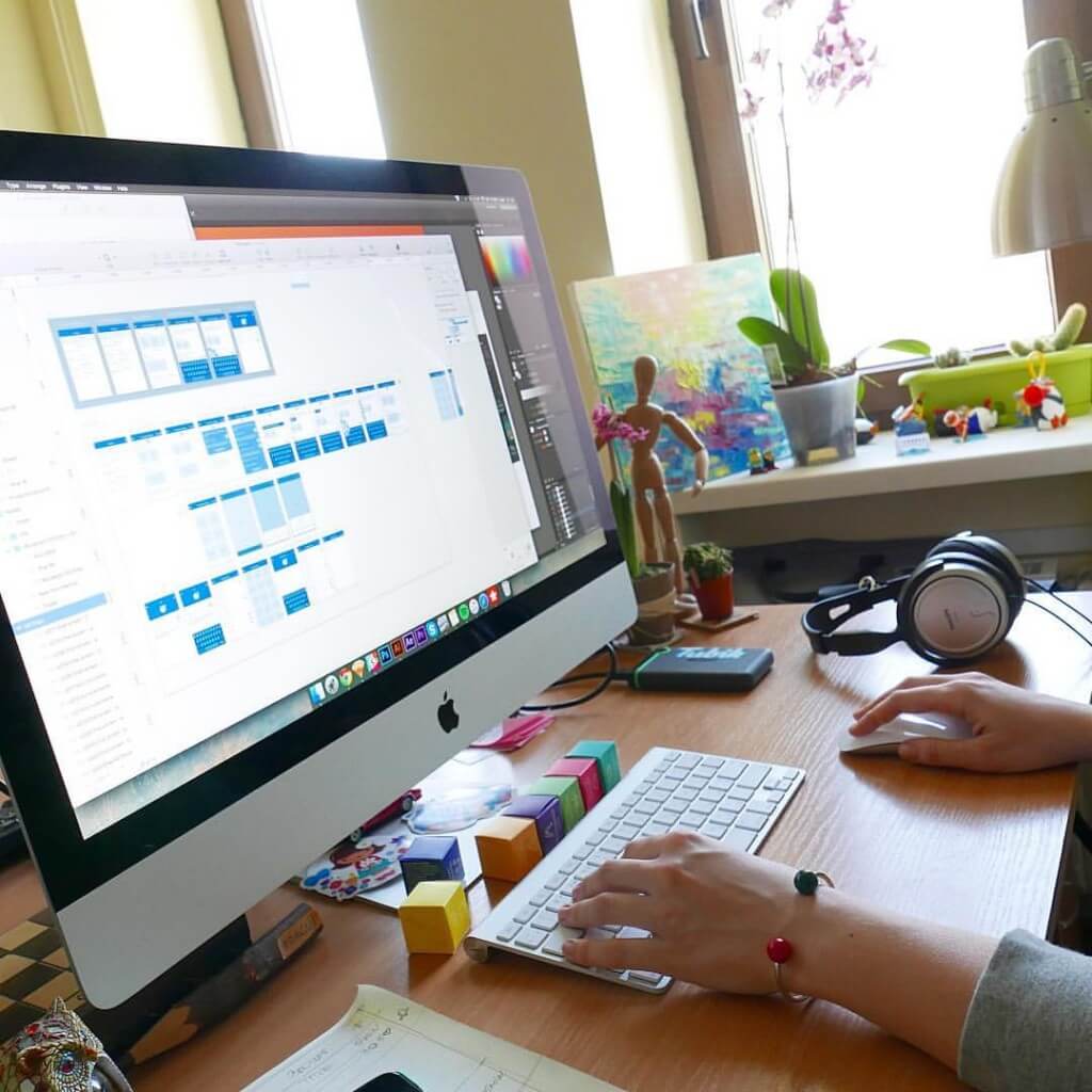
That is the aim of the UX part of the design process. UX wireframing stage should be heavily based on user research, competition research, and analysis of all the data obtained. In the outcome, it creates a clear scheme whose complexity depends on the product functionality and reflects all the systems of transitions and interactions as well as placement of all the elements of the interface based on their optimal use flow. In some cases, wireframing done in pencil sketching or rough drafts is enough, although preferably it is accomplished with the special tools and software optimizing the design process and increasing performance.
Prototyping
The original concept behind the term ‘prototype’ is the sample model of the product that gives the ability to test it and see if the solutions and decisions made about the product are efficient. Prototypes should not be seen as the analog of the final product as they aren’t those. Their main aim is to enable a designer, a customer, and a user to check the correctness and appropriateness of the design solutions.
The value of prototypes in the sphere of the app and web design has rocketed for the last few years. Actually, it is easy to explain as even the low-fidelity prototype gets the designer, customer, and tester much closer to the looks and functions of the future product than the most elaborate schemes, drawings, and wireframes. Certainly, that doesn’t mean that schemes and wireframes could be eliminated from the process as they are essential in the process of creating design solutions. However, when you want to feel their efficiency and check if nothing has been missed in the design process, the prototype will be a great help.
Considering the fact that a lot of customers see the prototype as something very close to the final version of product design aka “UI in action”, in practice this approach is not effective. Prototyping is much more efficient and useful as the step between UX design and UI design. So, here in Tubik Studio, we support the workflow having the sequence «UX – prototype – UI».
The prototypes on the UI stage can be created for the presentation of application general looks rather than for testing and improving its functional features. And this is the trap in which it is easy to get confused. Prototyping all the details on the final stage of UI in most cases is not so reasonable as it could seem. It will be too time-consuming and in this perspective, it would be better to spend the same time coding a demo-version. Moreover, usability should be thoroughly checked first of all at the UX stage, otherwise, it would be much harder to change inefficient solutions after having accomplished a lot of work on UI. Certainly, it would be amazing to create prototypes both for UX and UI, but by far not all the designers and customers agree to spend so much time on design tasks and want to test and improve the design much faster and cheaper.
UI (User Interface) Design
User Interface is actually a finalized interactive field in which the user interacts with the product. It includes all the tools of increasing usability and satisfying target users’ needs and wishes. All the features of visual perception as well as sound and tactile feelings influencing the product use and interaction with should be analyzed and optimized here to the purpose of the app or a website is designed. For example, such aspects as color palette, typefaces and fonts, shapes and forms, illustration and animation, and so on and so forth are able to affect the performance of the final product greatly in both positive and negative ways.
In general terms, the UX research and wireframing stage are about how the website or application works while UI is how it looks. Both these stages include work on successful interactions, but UX deals more with logic, connections, and user behavior while the UI stage provides a visual representation of all the concepts. It means that ideally, designers should first work on the UX part with a concentration on layout, making it more powerful, thought-out, clear, and easy to use. Without this vital work, you highly risk creating a pure mess out of the user interface.
After the UX part is tested by prototype, agreed upon and the concept of layout, transitions, and features are accepted, the designer starts the UI design part. This is the time when a newborn heart and brain of your product are clothed with its skin and bones. Here the product gets its real color scheme, forms, and features of the layout details, styles, animated elements, and so on.
All the UI solutions directly influence the positive or negative user experience, so the processes of UX wireframing and UI design should mutually support each other and follow the same strategy otherwise the efficient solutions of one stage will not work on the other.

Animation
Telling about the details and benefits of interface animation used in mobile apps, we mentioned that the most efficient way is to consider this aspect through all the creative stages. However, the high time to apply it in practice is when UI design is basically accomplished and the general stylistic concept is agreed upon.
Like everything that is put into the interface and process of interaction with it, animation must be a functional element, not just a decor. Considering motion elements while planning user journey around the digital product, designers should deeply analyze its potential for increasing usability, utility, and desirability of the product before making a decision to apply it in the layout or transitions. Animation in UI requires a thoughtful approach and always needs to have a clear purpose set behind. The advantages and utility of using it in the interaction process have to be obvious and outweighing the possible disadvantages.
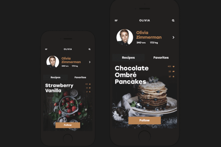
After this stage is accomplished, the visual details approved and agreed upon, designers transfer the assets to developers who are going to do the magic of making them alive. Also, this is a good time to review the estimation once again and plan the clear sprints on development on the basis of thought-out design.
Software architecture planning
A noteworthy detail is that scalability is one of the most important things for a mobile application. Planning of software architecture can take place as a stage parallel to design. This is a complex process: it usually includes a lot of iterations, with a constant feedback loop between the design team and the development team. The main goal of architecture planning is to create a constructive and integral plan for the software architecture of the app (front-end and back-end). At this stage, developers decide on the most efficient technical and technological solutions for actual realization of the app and maintaining its operability. The decisions depend on various factors, for example, the nature of the product and data it processes, the complexity of design solutions, the necessity to save data and availability of log-in functionality, etc. Back-end development sets the bridge of the app with the web and supports the synchronization of data in both directions.
iOS development
The actual process of coding the app here in Tubik is done in Xcode as an effective and flexible platform with broad functionality for iOS developers. As it is defined on the official website, «Xcode is Apple’s integrated development environment (IDE). You use Xcode to build apps for Apple products, including iPad, iPhone, Apple Watch, Apple TV, and Mac. Xcode provides tools to manage your entire development workflow—from creating your app to testing, optimizing, and submitting it to the App Store.»
Xcode only runs on Macs and has everything developers need to build iOS apps. There are no official ways to launch it on a Windows or Linux PC. This means that if somebody wants to develop an iPhone, iPad, Apple Watch, Apple TV and Mac apps but doesn’t have a Mac, he or she will need to buy it.
Two basic and most popular programming languages for iOS development are Objective-C and Swift — we considered the benefits and drawbacks of each in our earlier post. Since 2014, Swift language has been used by Xcode for coding more often than Objective-C, which is a difficult language for developers to learn and code. Still, Objective-C is a good fit for early iPhone hardware which has less RAM and slower processes and it is also effectively applicable for maintaining and updating the apps initially created in it. Swift keeps step with modern hardware and it is also faster in the process of coding, it is more easy-to-use, shorter, and secure. For creating iOS 10 apps, Xcode 8 and the iOS 10 SDK need to be installed, also available from Apple. There are significant changes to the Swift language and the SDK in this version of Xcode.

In this phase of mobile app creation, iOS developers think over the architecture of the app, write the code, integrate functionality to created UI, edit source code, debug and finally export the app to the App Store. Also, writing unit tests and running integration testing are relevant steps in this phase. The Interface Builder is one of Xcode features and it is an alternative to hand-coding the client-side part, allowing developers to put the app code together visually. This feature allows dragging and dropping different visual controls into the app code. AutoLayout helps to control the app presentation based on the size of the user’s screen. With Storyboard, developers can see what each screen of the app actually looks like, while Preview Mode delivers a prior acquaintance of what the app will look like when it is done.
Lots of mobile app developers are of opinion that a text editor is generally necessary, even though it is theoretically possible to do the entire coding inside Xcode. Handling long and complex codes can become particularly confusing unless programmers use a text editor that supports all relevant programming syntaxes.

In most cases, while part of the developers’ team is building the client-side part, the other part is coding, integrating, and linking to the front-end server-side components of an app such as database, APIs, middleware, etc.
It also should be noted that planning the workflow and the number of people involved in the development process depends first of all on the complexity and urgency of the project. For small projects, one iOS developer may be able to create all components of software architecture for the app. For multilayered, complex projects, at least a couple of programmers should be engaged, having experience in software architecture and good expertise in both client-side and server-side development.
The main task of this phase is to make a fully working app that is scalable and integrated to all required server-side components like a database, APIs, and other related infrastructure it needs to run. If clients aren’t ready to build the original server-side infrastructure, they can buy a Backend as a Service (BaaS) software bundle or other products. The bundles include a variety of storage options and features, but they aren’t completely “turn-key” as well as they often do not provide the options of deep and comprehensive analytics. It means the client needs a developer who understands back-end engineering to integrate it into the app.

Testing
“Quality is never an accident; it is always the result of intelligent effort”, John Ruskin once said and it’s definitely true when it comes to digital product testing.
Testing is one of the crucial phases of the entire app design and development lifecycle, it can help to find bugs before the app is brought out to actual users. App Store will not accept any apps that have compiling errors and bugs, so the mobile app is prepared for submitting has no chances with those kinds of issues. In the majority of cases, users abandon the app if it has functionality problems, no matter how promising and engaging it seems. Even the simplest apps can be successful for commerce, business, advertising, and other aims if they work correctly and efficiently, according to the target audience’s expectations, and solving their problems.
Testing doesn’t mean that developers do not provide the upper quality. To set the analogy, the fact that every book, magazine, or newspaper issue goes through the editor’s eye doesn’t say that journalists or writers are not talented and qualified. Different specialists have different goals and skills in the process to increase general productivity and efficiency, and it works the same way for the design and development of mobile apps. Supposing that developers have done a great job and made no mistakes, the task of testing is not only finding errors. Quite the opposite, it helps to understand the quality of the app and find a way to improve via real interactions.

Automated testing got really popular now because it is effective, cheap, and reliable. iOS Simulator and other testing tools such as Appium, Frank, Calabash, and others are available to help to run the app through the testing process and point out the issues requiring attention. Continuous testing at all stages helps to keep small bugs from becoming major issues later on.
In the process of testing, the developer usually goes all the way through the app on a device or in the iOS Simulator of Xcode, screen by screen, to ensure there are no bugs or errors and everything works properly. Fixing or debugging can be done right in Xcode.
All aspects of the app should be tested. Developers will need to check it across different devices (iPhone, iWatch, iPad, iPod, etc.) as the points like screen resolution, processors, battery life, and memory will be different and can significantly affect how the app runs. They also test functionality (Do all the functions work well?), handling and loading time (Will it slow down if traffic increases?), and UX (How easy is it to use?). In addition to the above-mentioned issues, developers review crash reports seeing what should be fixed.

Here are some types of testing applied in the process of mobile app creation:
Functional testing. It is the most basic test for any application to ensure that it is working according to the defined requirements and there are no functions missed in the process of interaction.
Performance testing. This type covers client application performance, server performance, and network performance. For example, it checks the performance specifications and behavior of the app under certain conditions such as the low battery, bad network coverage, low available memory and etc.
Memory testing. This type checks that each application maintains optimized memory usage throughout the user surfing.
Interruption testing. An app may face various interruptions while working, such as incoming calls or network coverage outage and recovery. This kind of testing shows what will the app do under these conditions. The common types of interruptions are:
- Incoming and Outgoing calls, SMS or MMS and different notifications;
- Low memory warning
- Cable insertion or removal
- Network outage or recovery
- Media Player on/off
- The device power cycle, such as low battery notification, etc.
Security testing. It checks the vulnerability of the app to hacking, authentication and authorization policies, data security, session management, and other security standards.
Usability testing. It is carried out from the early stages of app creation to verify if the app fulfills the established objectives and tasks getting a good response from users. As Joyce Lee, the representative of Human Factors Design at Apple mentions: «Usability answers the question, “Can the user accomplish their goal?»
Submitting / Release
Finally, there comes the day when the app is alive and ready to be introduced to its users. In order to be submitted to the App Store, it needs to join the iOS developer program. Apple reserves the right to review and approve the app before it can go live. In any case, it is advisable to plan around a week or so to have the information reviewed and approved by Apple. If the app will be used for commercial purposes, an additional step to submission via filling in short surveys will be included in the process and will need separate approval which is usually expected within a day. The process of the app release in the App Store takes a few steps, including configuring the code, creating a profile, creating a listing, then submitting it through Xcode for certification. It might involve a few fixes and re-submissions, so it is helpful for iOS developers to know the ways and what to expect.
As you can see, the way, which a mobile application goes through, is quite complex and includes a variety of steps ensuring its functionality, beauty, and quality of performance. Don’t miss our next articles that will provide deeper insights into each of the stages as well as tools and tips for a better design and development process.
About the Author: Marina Yalanska is content manager and writer for Tubik Studio, tech/design blogger and researcher


