Icons have been used on a limited basis since the early days of computer graphics.
There are several reasons why the use of icons might have advantages over text in terms of human-computer interaction:
- Simple, bold, and friendly, they can replace a long (and usually boring) descriptive group of words.
- They save space on the screen and as screens get smaller, this is much welcomed.
- Visually pleasing, they can also enhance the aesthetic appeal of a design.
- Last but not least, most apps use icons, it’s a design pattern which is familiar for the users.
Despite these potential advantages, icons often cause usability problems when they are designed without consideration for their many potential downsides. In this article, I’ve tried to summarize the main problems associated with the icons in UI and suggest a set of solutions to these problems. Use these tips as a starting point to ensure that your app icons work for you and your app, not against you.
1. Icons Should Communicate Meaning
Designers sometimes hide functionality behind icons that are actually pretty hard to recognize, breaking the most important property of the imagery — icons must first and foremost communicate meaning. Icons are, by definition, a visual representation of an object or action. If that object or action isn’t clear to users, the icon immediately lose it practical value and becomes a visual noise.
There are a few icons that enjoy mostly universal recognition from users (the icons for home, print, and the magnifying glass for search are such instances):

Easily recognizable icons. Image credit: icons8
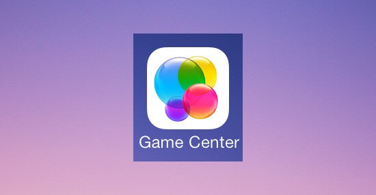
But outside of these examples, most icons continue to be ambiguous to users due to their association with different meanings. The Game Center icon, for example, is a group of colorful, glassy-looking circles. What does the Game Center icon mean? How does it relate to gaming?

Game Center icons fails to convey game concept.
Let me give you another example: when Google decided to simplify Gmail UI and move everything behind an abstract icon, they apparently got a stream of support requests, like “Where is my Google Calendar?”

Gmail user interface for desktop.
No matter how much sense an icon makes once you know what it’s supposed to represent, it can be a completely different experience for first-time users. And it’s a common mistake to assume that your users are familiar with abstract pictograms.
Your icons’ primary task is to guide your users to where they need to go, so make sure that they are able to achieve this goal:
- Use the 5-second rule: if it takes you more than 5 seconds to think of an appropriate icon for something, it is unlikely that an icon can effectively communicate that meaning.
- Choose familiar icons. A user’s understanding of an icon is based on previous experience. Familiarize yourself with icons used by your competitors and with icons commonly used on the platforms (existing system icons) that you target, as those will be most recognizable to your users.
2. Keep Icons Simple and Schematic
In most cases, icons aren’t the place to be creative. Don’t get me wrong — I’m not saying that creative icons are bad, but too fancy icons for basic functions might have negative impact on user experience. If you want to master your design skills you can rely on your other design elements to convey your product message while keeping the design of system icons simple, modern and friendly.
Each icon should be reduced to its minimal form, with every idea edited to its essence — simplistic icons are there to reduce the need for a learning curve. Well-designed icons are fast to recognize at a glance, because the designs ensure readability and clarity even at small sizes.
3. Include a Visible Text Label
A good user experience can be defined in many ways, but one measure is the ability to reduce the user’s effort to think. Clarity is the most important characteristic of a great interface. Your icons should help your users do what they need to do without requiring brainpower. However, the problem with icons is people associate different things with each icon based on their past experience. And it’s another common misconception to assume that users (especially mobile users) will play with all the different icons in order to discover what each icon does.

The Apple Mail customization screen. Are you able to correctly identify what each icon is supposed to represent? Image credit: ia
In reality, users are often intimidated by unfamiliar interfaces and don’t explore outside their comfort zone. To help overcome the ambiguity that almost all icons face, a text label must be present alongside an icon to clarify its meaning in that particular context. Your icons need to set clear expectations for users before they click or tap on them.

Here is the same choice of icons with labels. Labels explain icons, so adding labels improves usability. Image credit: ia
UserTesting conducted a series of tests “labels vs. no labels” for icons and found that:
- For icons with labels, users were able to correctly predict what would happen when they tapped the icon 88% of the time.
- For icons without labels, this number dropped to 60%. And for unlabeled icons that are unique to the app, users correctly predicted what would happen when they tapped the icon only 34% of the time.
There are three important moments which should take into account:
-
- For more complex actions or abstract functions, pictographic representation has its limits. So they should always be displayed with a proper text label.
- Icon labels should be visible at all times, without any interaction from the user. Some designers find that labels defeat the purpose of using icons and clutter up their interface. To avoid using labels, they’ll include instructions for using icons in tutorials/coach marks/popover hints. But users might simply skip through the tutorial or quickly forget everything they’ve learned. Also don’t rely on hover to reveal text labels: not only does it require an extra action from the user, but it also fails to translate well on touch screens.

Swarm app use popover hint in attempt to educate users.
- Label and image are better than just one or the other (image or text). However, if using only one text works better than just the image. In the battle of clarity between icons and labels, labels always win.
4. Make Icons Good Touch Targets (Mobile Apps)
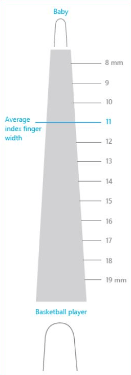
People interact with touch-based user interfaces with their fingers. So UI controls have to be big enough to capture fingertip actions without frustrating users with erroneous actions and tiny targets. The image below shows that the width of the average adult finger is about 11 millimeters (mm) wide, while a baby’s is 8 mm, and some basketball players have fingers wider than 19 mm!

People often blame themselves for having “fat fingers.” But even baby fingers are wider than most touch targets. Image credit: Microsoft
The recommended target size for touchscreen objects is 7–10mm. Below are recommendations for Apple and Google platform guidelines (iOS Human Interface Guidelines and Material Design):
- Apple recommends a minimum target size of 44 pixels wide 44 pixels tall. Since physical pixel size can vary by screen density, Apple’s pixel specifications apply best to the iPhone’s 320 by 480 pixel, 3.5 inch display.
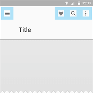
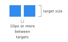
- Google has following recommendations for touch targets — they should be at least 48 x 48dp. In most cases, they should be separated by 8dp of space or more to ensure balanced information density and usability. A touch target of 48 x 48dp results in physical size of about 9mm, regardless of screen size. Touch targets include the area that responds to user input. Touch targets extend beyond the visual bounds of an element: an element like an icon may appear to be 24 x 24dp but the padding surrounding it comprises the full 48 x 48dp touch target.

Clearance area. Icon: 24dp
Touch target on both: 48dp. Image credit: Material Design

Placement. Image credit: Material Design
Important moment which should be taken into account:
- Sufficient spacing between touch targets. The main reason to have a minimum distance between touch targets is to prevent users from touching and invoking the incorrect action. This becomes extremely important in scenarios where you have icons like “Save” and “Cancel” right next to each other. Using at least 2 mm of padding between targets is extremely important in this case.

5. Don’t Carry Over Platform-Specific Icons
As you build your app for Android/iOS, don’t carry over themed UI elements from other platforms. Platforms typically provide sets of icons for common functionality, such as sharing, creating a new document or deleting. As you are migrating your app to another platform, you should swap out platform-specific icons with their counterparts.
6. Test Your Icons
The icons you use need to be handled with maximum care: always have them usability tested. Once you’ve gotten used to an interface, it can be really difficult to see it with fresh eyes and tell whether your icons make intuitive sense. Thus, it’s very important to watch how a real first-time user interacts with your UI because it will help you determine whether your icons are clear enough:
- Test the icons for recognizability. Ask people what they expect the icons to stand for. Avoid designing icons that make people wonder what they do because no one will bother finding out.
- Test the icons for memorability. Icons that are hard to memorize and are often highly inefficient. Ask a repeat set of users if they can remember the icon’s meaning after being told what it represented a couple of weeks earlier.
Conclusion
Iconography gets to the heart of UI design: it can make or break the usability of an interface. Like every other area of user experience design, any icon in your interface should serve a purpose. When done correctly, icons can help you guide users intuitively through a workflow without relying on too much copy.
About the Author: Nick Babich is a software developer and author of a blog dedicated to usability
Try free tools for creators by the Icons8 team
Also, get the lists of free vector software and free photo editing software.


