Design is one of the most important drivers of user engagement. As users’ preferences shift toward a simpler interface, stripping the UI to its very basic, necessary elements are the key to success. Minimalism is a perfect marriage of form and function. It’s the greatest strength is clarity of form — clean lines, generous whitespace, and minimal graphical elements brings simplicity to even the most confounding subject matter. That is, of course, if it’s used effectively.
Minimalist design has to be concise, clear, and consistent to be usable. Your interaction system should aim to address problems for your users through clear visual communication. This is why a beautiful minimalist app combined with great usability is so impressive: an easily navigated, a simple app can be a very powerful form of communication. But in order to achieve this goal, you need to focus on the following moments.
Simple Color Scheme
Simplifying the color scheme improves the user experience while having too many colors can have a negative impact on it. There are a number of predefined color scheme standards that make creating new schemes easier, especially for beginners:
- Monochromatic scheme. Monochromatic color schemes are made up of different tones, shades, and tints within a specific hue. By modifying the saturation and brightness of a single hue, you can generate multiple colors, and color scheme it’s not overwhelming on the eye.

Single-hue blue color scheme. Image credit: Smashing Magazine
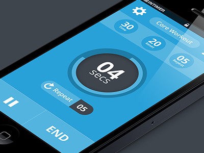
Image credit: Dribbble
- Analogous color scheme. Analogous schemes are created by using three colors that are next to each other on the color wheel. A minimalist gesture-driven task manager app Clear use analogous colors to visually prioritize important tasks and highlight the most critical ones (the topmost items will be the boldest in color, while items lower on the list will be lighter and more subtle).
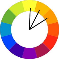
Shades yellow and orange is an example of an analogous color scheme. Image credit: tuts+
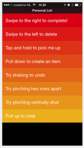
Clear app for iOS
Blur Effects
Blur effect arises as a logical solution to a minimal user interface, allowing a certain amount of play with the layers and hierarchy of the interface. It’s a very efficient solution when working with layered UI since it gives the user a clear understanding of mobile solution flow. This also gives designers a perfect opportunity to explore different menu and overlay solutions.
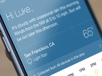
Yahoo! weather app displays a nice photo of each weather location, and the most important data you need is immediately visible while it’s just a single tap to drill down into more detailed data. Rather than cover the photo with another UI layer, the app keeps you in context after you tap — the detailed information is easily revealed and the photo remains in the background. The interaction is so intuitive that it takes nothing more than a second to return to your previous location.
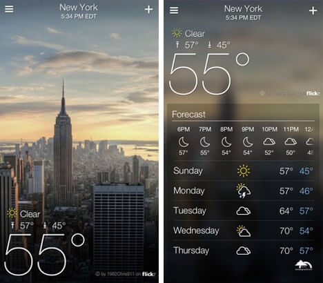
Yahoo! weather app for iOS
One App, One Typeface
Mixing several different fonts can make your app seem fragmented and sloppy. Reducing the number of fonts on a screen can reveal the power of typography. When designing an app think about how can you make the typography powerful by playing with weight, style, and size, not different typefaces.
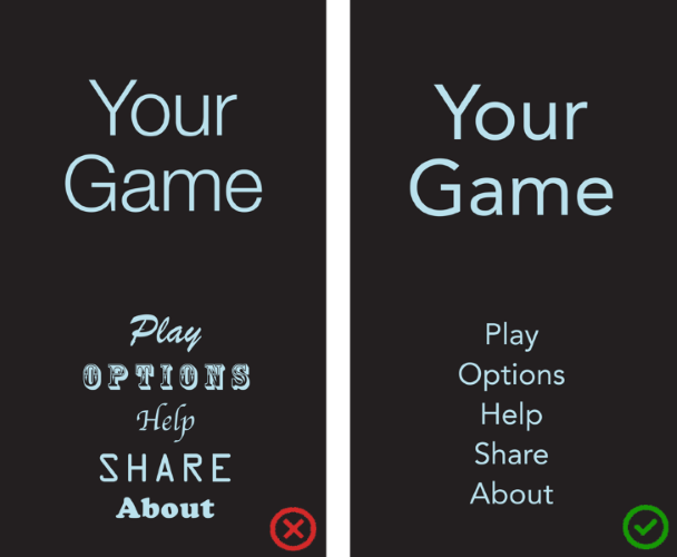
In general, use a single font throughout your app. Image credit: Apple
When you choosing a typeface for your app keep in mind that a safe bet is to rely on the platform’s default font:
- Apple uses the San Francisco family of typefaces to provide consistent reading experience across all platforms (the San Francisco font for iOS 9 is called SF-UI).
- Roboto and Noto are the standard typefaces on Google Android and Chrome.
Reducing the number of fonts on a screen can reveal the power of typography. Image credit: Dribbble
Data Spotlight
You should use a big font size and striking color to make certain data the center of focus. Using neutral colors for the general scheme and adding contrasting colors for calls to action, helps the user focus on the action we want them to take.

Bright accent color into an otherwise-neutral palette is one of the easiest color schemes to create. It’s also one of the most striking, visually. Image credit: Smashing Magazine
Increased font size and an accent color draw the users’ attention to a particular area of the screen without additional visual hints. This provides an easier information-gathering experience.
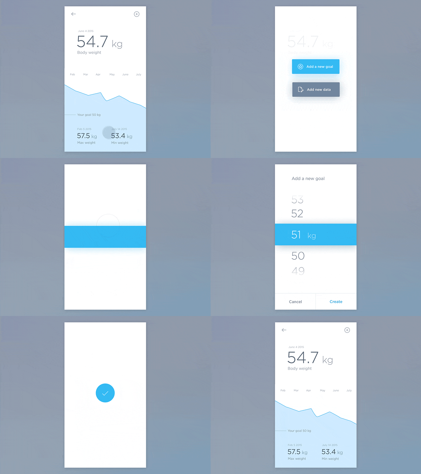
Increased font size and a pop of color draws the users’ attention to a particular area of the screen. Image credit: Dribbble
Divide by Elements and Spacing, Not Lines
Lines and dividers often used to clearly delineate specific sections or categories within a screen. But adding too many of these elements can result in crowded interfaces.
Less lines and dividers will give your interface a cleaner, modern and more functional feel. There are other ways to separate content with methods such as using blocks, spacing or colors. Calendar App from Google is a good example of how leveraging space and using shadows instead of drawing lines help to define different sections in a non-obtrusive manner.
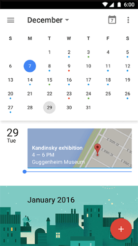
Spacing provides visual clarity and improved ease of use in Calendar app
Icons: Stroke and Fill
Iconography is a visual language used to represent functionality or content. Icons are meant to be simple, visual elements that are recognized and understood immediately. Since iOS 7 many minimalist UI has stroke and filled icons. In this article we won’t criticize the concept itself, instead, we’ll focus on the practical aspect — stroked and filled type of the same icon:
Let’s take a look at tab bar icons. Because bar icons serve as navigation to other sections of the app, it’s important to indicate which section is currently active by highlighting its icon in some way: a solid version to show an active/selected state and a hollow version to show an inactive/unselected state. This makes the recognition of active tabs and controls more straightforward.
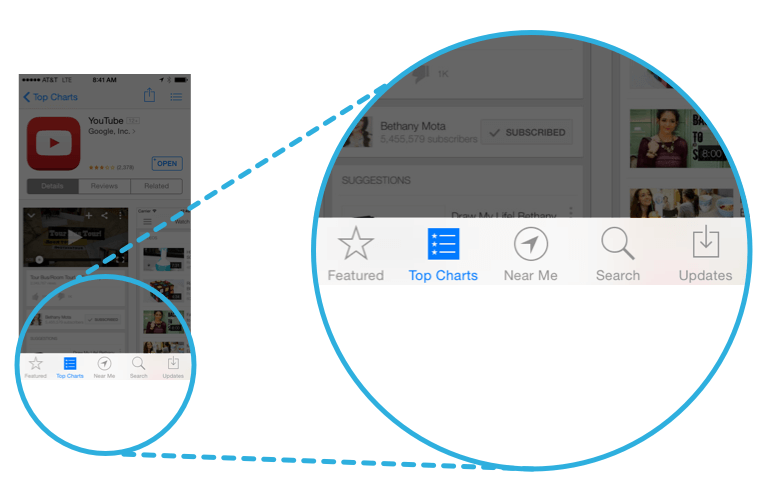
Tab bar in AppStore app from Apple. Image credit: viget
Conclusion
Minimalist interfaces and other design techniques are certainly a way to achieve good design, but they are not the goal. The ultimate goal is to simplify our interfaces and make them more functional and usable. Simple user flows, clear visuals and forgiving design help create a seamless interaction.
About the Author: Nick Babich is a software developer and author of a blog dedicated to usability
Try free tools for creators by the Icons8 team
Also, get the lists of free vector software and free photo editing software.

